
Virgin Media Home Movers
A redesign and restructure
When customers with an active Virgin Media contract move home, they use the Home Movers journey to check service availability at their new address and manage their move or disconnection. The journey helps with two key scenarios: transferring service to a new property or cancelling if Virgin Media is unavailable. In both cases, customers should be able to self-serve by selecting their disconnection and activation dates, or choose a cancellation date if they’re leaving.
My role
UX/UI Designer
Researcher
Tools used
Figma
UserZoom
Contentsquare
Homepage
Existing landing page
Above is the mobile landing page for Virgin Media home movers at the time of my coming to work on its overhaul. As you can see, despite the page being longer than six iPhone 13 mini screens, it fails to provide the user with meaningful information. Contentsquare data validated that the existing design failed to deliver value to the user. As a result, I set about trying to reduce marketing jargon and reduce the length of the page whilst simultaneously increasing how useful it’ll be for someone who would like to take their broadband with them when they move home.
Data and hypotheses
Only 40% of people used the postcode checker, and users are 19x more likely to find that the page did not help them than find that it did. Therefore 60% of people are looking for something other than if their new address is serviceable, and the current page does not provide them with what they’re after.
Timeline
9 months and ongoing
The home movers journey supports approximately 800,000 customers each year, making it one of the most heavily used flows on the website. Despite this scale, the experience was yet to receive the time it needed and remained largely non self-serve, with customers only able to complete their move online in a limited set of scenarios. In most cases, users were diverted to chatbots or call agents to finish what should have been a simple task.
This dependency resulted in high call volumes and avoidable churn, making it clear it provided an unsatisfactory user experience. An end-to-end overhaul was required to empower users to complete the journey themselves.
I led the UX design across the journey, from research through to concept design and iterative testing. To understand user pain points, I spent time in the Glasgow call centre listening to live customer calls and interviewing agents. Insights from this research informed early wireframes, which were refined collaboratively with agents. Alongside qualitative research, User behaviour and drop-off points were analysed using Contentsquare and throughout the design process, concepts were tested with users via UserZoom, with each iteration refined based on feedback.
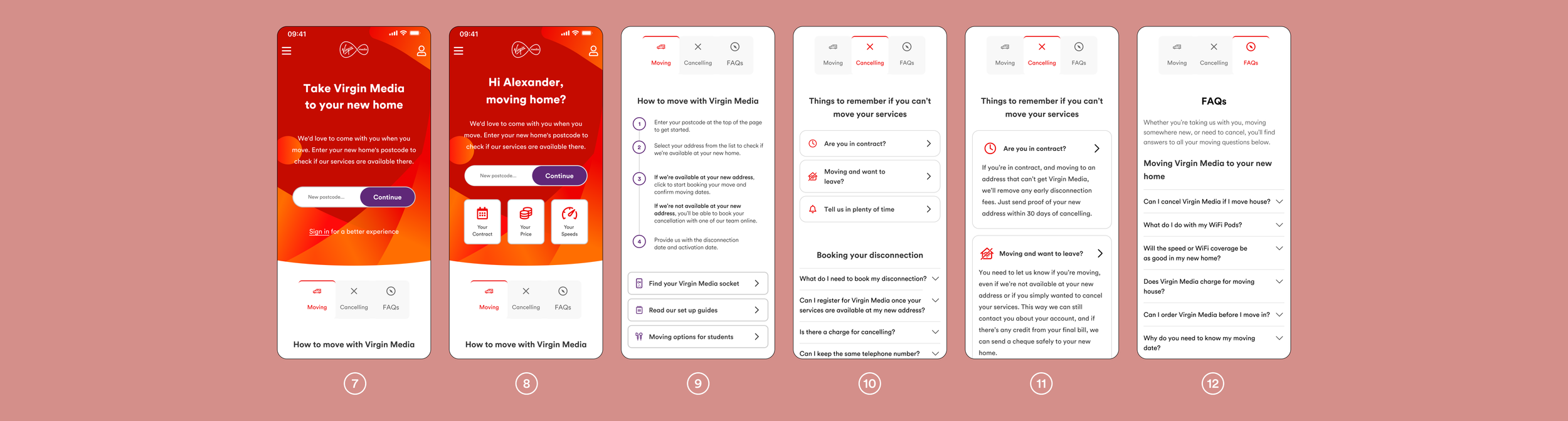
The FAQs are only viewed by 11% of users visiting the page, this leads us to believe that the page is too long. Further, given that the page is almost 8000px, only having 11% reaching the bottom which suggests that users aren’t engaging with most of the content.
Customers who saw the FAQ’s were over 4x more likely to click on the ‘Can I cancel Virgin Media if I move house’ FAQ than any other on average. Despite the strong customer desire for information on how to cancel their contract, the page provided no significant information on this.
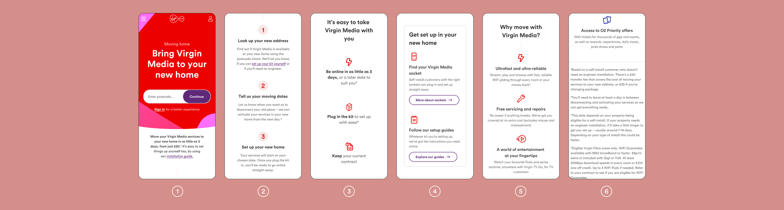
Page 1 and 2 from above show the screen that first greet logged-out and logged-in customers respectively. When creating these headers I wanted to create the feel of a splash screen. Virgin Media uses flares as its main graphic element, and using them I created a header to feel like a piece of art. By decreasing the opacity in certain parts of the flares at the bottom of the header, I was able to create a shadow effect as they overlap, giving them a sense of depth.
The header was not redesigned using metrics. As a non-interactive element, there was no meaningful quantitative data to inform its design, so I used it as an opportunity to introduce personality and intent rather than optimisation alone. Just as modern buildings function without ornament yet fail to evoke emotion, design that focuses solely on efficiency can feel invisible. I believe effective design should not only work, but resonate leaving users with a sense of care, intention, and craft. In UX, data and metrics are essential for guiding decisions, but an over reliance on optimisation can lead to designs that feel overly safe or clinical. For this project, I was conscious of balancing usability with expression.
The page selector seen at the tops of screens 9-12 was created to combat the issues found across focus groups, user testing and Contentsquare. The main issues were the length of the page, the lack of useful information, and no clear guidance on how a contract can be ended. I learned that users strongly prioritise clarity and speed over jargon, and that the existing page design doesn’t help the user find key information. Seeing that only 40% of users clicked on the postcode checker, I moved from to a single flow of content to multiple flows that would prioritise certain tasks. Using a page selector to divide information into three separate groups reduces the amount of scrolling users are required to do, helping them to find information much more easily. Further reducing scrolling was done by making CTAs more compact. In both screens 4 and 9 you can see users are able to find information regarding wall sockets and a set up guide, however one takes up a full screen and the other takes up only a quarter. Having a dedicated cancelling page allows users to feel safe in the fact that they can leave Virgin Media without repercussions. It’s very easy to build resentment towards a company that employs sneaky tactics to get you to stay, but I believe every user should be able to easily navigate any website regardless of their intentions.
Serviceable page redesign
Virgin Media is available
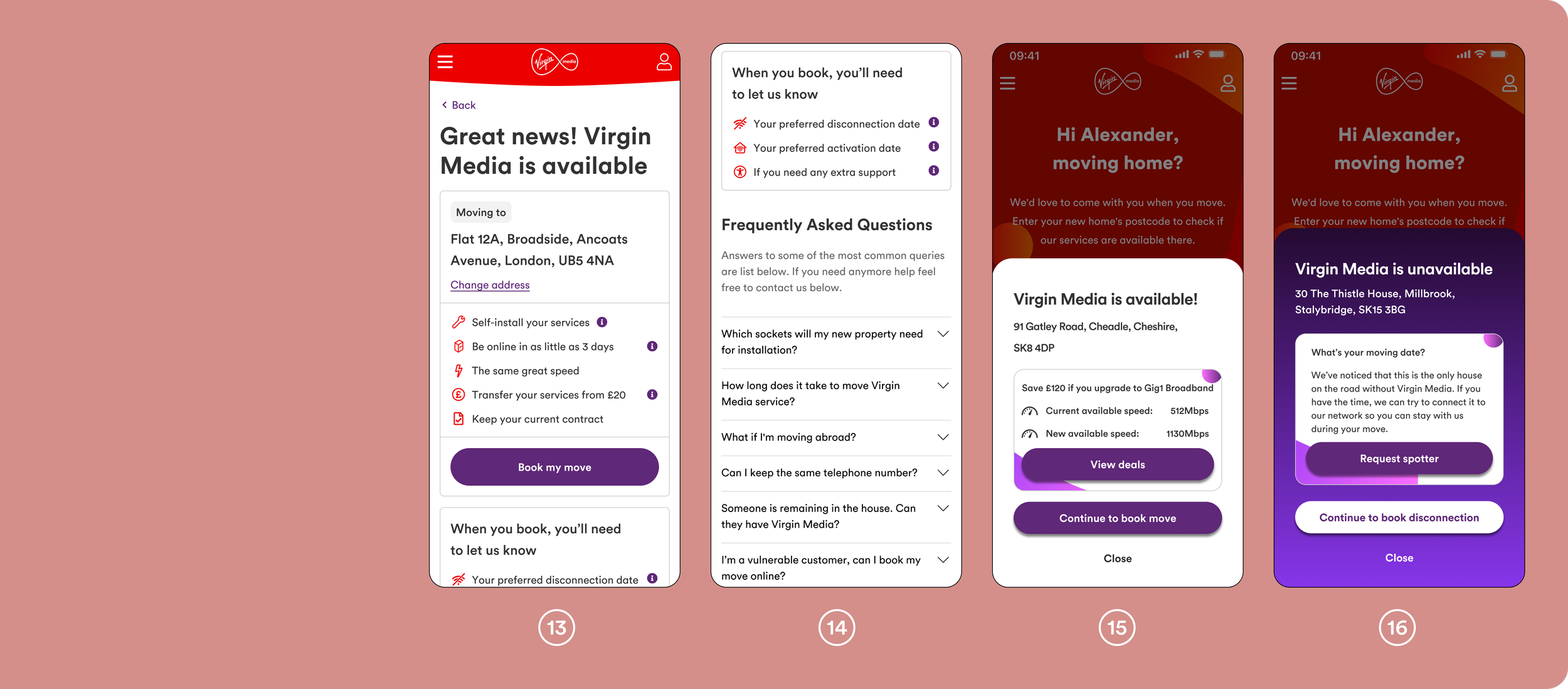
After entering a postcode and selecting ‘Continue’ (screens 1–2), the customer is informed whether the address is on Virgin Media’s network. Screens 13 and 14 show the previous experience at this point in the journey, where Contentsquare data highlighted high levels of churn.
CRO testing revealed that screens 13-14 were overloaded with copy that did not add value for the customer. Building on the bolder header aesthetic introduced in screens 7–8, I explored a simpler, more intentional approach. Rather than presenting this information as a full page, screens 15-16 introduce a pop-up. At this stage, the user’s primary goal to know whether their address is available or not. If it is, they can continue seamlessly; if not, they can quickly close the pop-up or tap the page background to return to the search and try another address.
Purple is Virgin Media’s tertiary colour and contrasts greatly from the white background shown in screen 15. Should a customer be searching multiple addresses they are interested in moving to, the contrasting background of screen 16 against 15 serves as a visual aid to let the user know this address is unserviceable. The ‘request spotter’ button was inspired by an interview with call agents that I held in one of my visits to the Glasgow call centre. It shows up when the address isn’t shown to be on Virgin Media’s network, but the other houses on the road are, which isn’t as uncommon as one may think. Should this not be the case however, this will be absent from the pop-up and it would be much more compact.
Screen 15’s pop-up also introduces an XSUS upgrade opportunity during the moving journey. As the movers journey attracts three times more users annually than the standalone XSUS journey, this created a significant new revenue opportunity that did not previously exist in screens 13 and 14.
FAQs were removed from this step, as they are already accessible earlier in the journey (screens 4 and 6). By removing unnecessary content and marketing language, and presenting the outcome clearly within a bold but simple design, screens 15 and 16 reduce friction and makes progressing to the next step faster and more intuitive.
Book your move
Accessibility, disconnection and activation dates
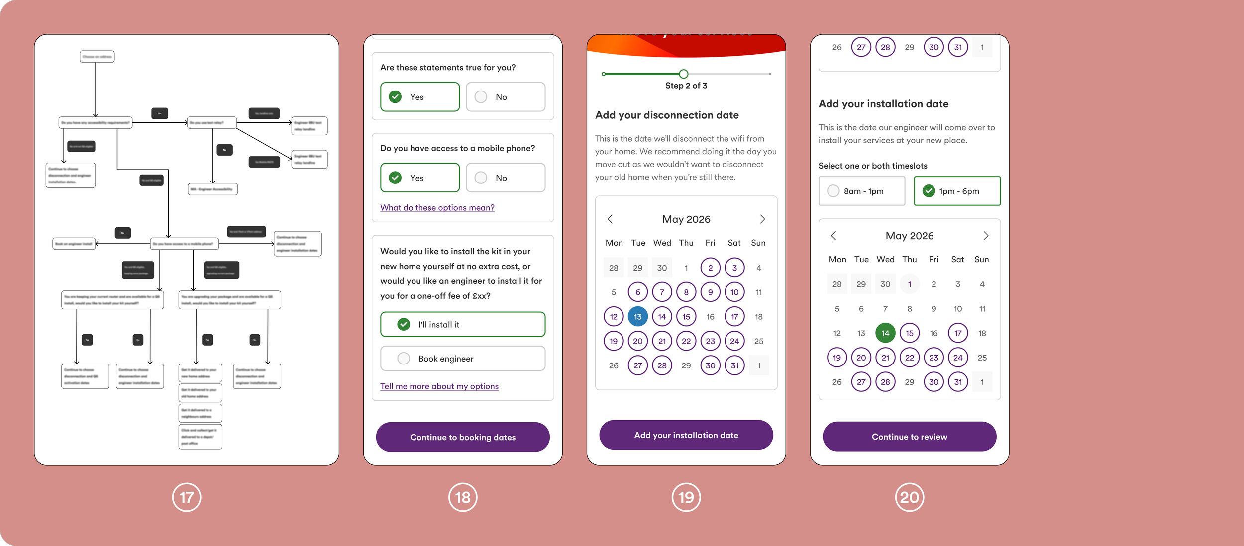
As with many areas of the Movers journey, the move-booking flow was not in a strong state when I began working on it. Customers were asked to select their disconnection and activation dates, confirm any accessibility needs, and then review their choices. While this worked for self-install moves, customers requiring an engineer installation were unable to complete the journey online and had to call instead.
To enable all customers to book their move autonomously, the flow needed to be restructured. I introduced an initial set of questions designed to determine whether a customer could complete a self-install or would require an engineer. Based on their responses, users were either guided through the appropriate self-serve journey or directed to a tailored flow for engineer installation. I consolidated the previously separate disconnection and activation date pages into a single screen, allowing users to easily scroll between and compare the two dates. The disconnection date calendar is first presented to the customer, and once a date has been selected and the ‘add your installation date button’ pressed the page automatically scrolls down to reveal a new calendar. This means that the customer is guided through the journey and reduces confusion between the two calendars. To further reduce errors and cognitive load, the disconnection date was styled in blue and the activation date in green, making each state immediately distinguishable. The disconnection date initially became red when selected, but user testing showed this was mistaken as an error message, and caused confusion, and hence was changed.
This restructuring removed unnecessary call dependency, reduced friction in the booking process, and enabled a wider range of customers to complete their move entirely online.
t the beginning of the booking journey, we observed significant churn. Our initial hypothesis was that customers were dropping off because they didn’t know their exact moving date, leading to decision paralysis.
To test this, I introduced a small CTA labelled “I don’t know my moving date.” This triggered a pop-up explaining that customers could select an estimated date and reschedule later. The experiment ran with CRO for 61 days. However, only 6.93% of sessions resulted in clicks on the CTA, indicating that date uncertainty was not the primary cause of churn. This reframed our understanding of the problem. Rather than adding flexibility options, we pivoted to reducing friction by minimising competing CTAs and streamlining the path between address confirmation and booking completion.
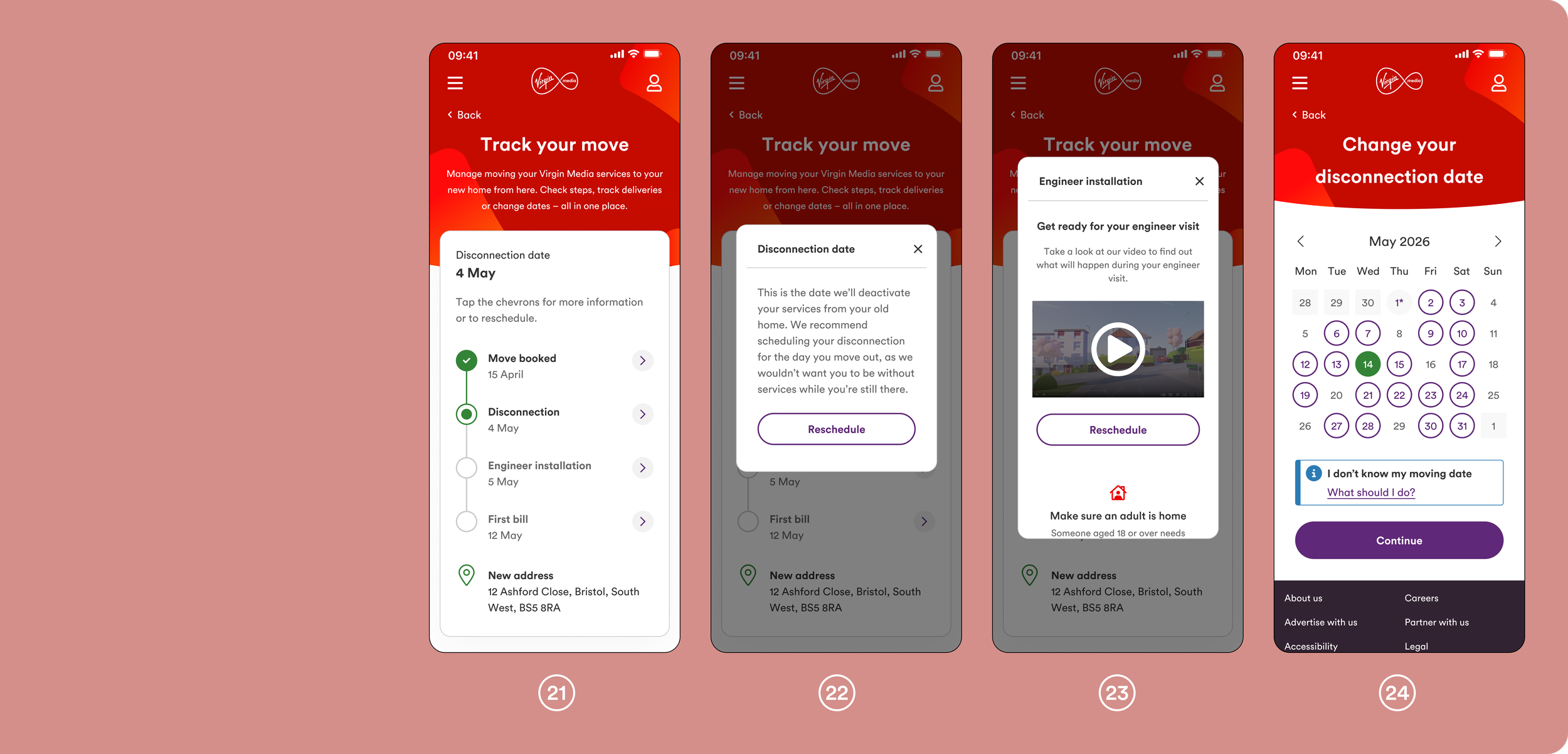
When I joined the project, customers received no information from the webpage after booking a move. All updates were communicated via email, and any changes required a phone call, creating unnecessary friction and increased call volume.
To address this, I explored how other apps present delivery and booking progress, which led to the development of a timeline-based experience (screen 21). Following discussions with multiple subject matter experts, I produced several timeline variants to account for the different ways a customer’s move could occur and how each scenario should be communicated.
Each stage of the move is expandable via a chevron, revealing additional details within a modal. Screen 23 shows the Engineer Installation modal. Information within the modal is scrollable to ensure it remains usable on smaller devices, such as the iPhone SE and 13 mini, while allowing developers to maintain a single modal size across devices.
From the timeline (screen 21), customers can reschedule key stages of their move. Selecting ‘reschedule’ takes the user to a dedicated page (screen 24), with a similar experience provided for rescheduling an engineer installation.
Earlier iterations displayed all supporting information directly on the page, either beneath the timeline or inline. This approach increased page length and reduced usability on smaller screens. Using modals via chevrons introduces an additional tap, but they allow the page to be easily scannable whilst remaining organised and logical.
Key takeaways
Track your move
The move has been booked
This project reinforced the importance of designing beyond individual screens and focusing instead on the end-to-end experience. By grounding decisions in real customer behaviour, frontline insights, and continuous user testing, I was able to simplify a complex journey while balancing business constraints and technical feasibility. Working closely with call centre agents and specialists highlighted the value of cross-functional collaboration, particularly when designing self-serve solutions that replace long-standing processes. As I continue iterating on this journey, I will focus on measuring long-term behavioural change post-launch and further refining edge cases to ensure the experience remains resilient as customer needs evolve.
Beyond this portfolio I have also created and changed multiple pages, however to prevent this page from being too long I have not included them.
Thank you for taking the time to read through my work.